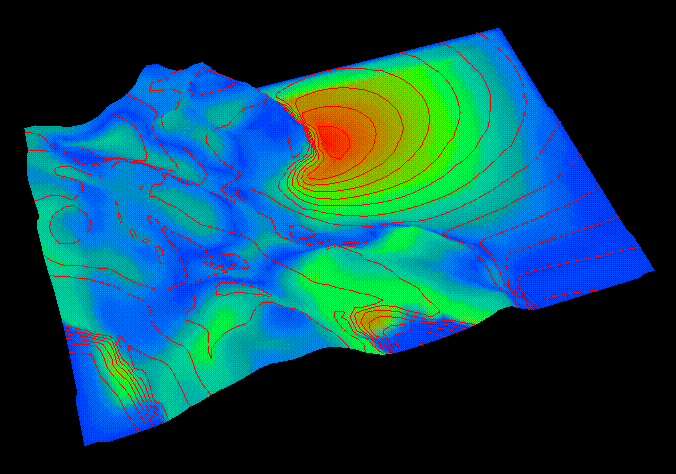
 Difference between observation and forecast. (66k)
 Temperature field difference from method 1. (46k)
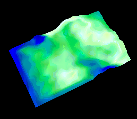
 Temperature field difference from method 2. (46k)
Weather forecasts are typically produced once or twice each day. Each run usually covers several forecast periods. Over the course of the day, as measured sensor data becomes available, discrepancies between observations and model forecasts are resolved and integrated so as to update and improve the next forecast run. The process of resolving the differences between model output and sensor measurements is known as data assimilation. Traditional methods include kriging and optimal interpolation. They involve statistical and historical information on reliability of sensor measurements (including desirability of sensor location, calibration, etc.), variability of the field, model resolution, initial and boundary conditions, etc.
Some of the parameters of a data assimilation model are integration techniques, choice and frequency of incremental update methods, interpolation algorithms, resolution of the model grid, estimation filtering and smoothing algorithms and finite differencing schemes. All of these parameters can have a profound effect on the tendencies displayed by a forecasting model. Hence, having visualization tools to display these possibly conflicting information is very useful for the scientists in quickly identifying regions of high conflict and/or regions of low confidence levels. Allowing the scientists to control the data assimilation variables can assist in constructing a protocol that is appropriate for a specific geographical region.
This paper presents a suite of visualization tools to aid scientists in performing their data assimilation analyses. These tools will provide an integrated display of 3D model outputs with 0D point measurements from meteorological stations, 1D measurements from wind profilers, sonde, and floating buoys, 2D measurements from CODAR current measurements and GOES satellite feed, and, when available, 3D volume measurements from NEXRAD data. The tools provided here will help extend the 2D domain in which data assimilation is currently being performed to include analysis of the overall method as well as visualizations of the separate weather measurements.
Difference between observation and forecast. (66k)
Temperature field difference from method 1. (46k)
Temperature field difference from method 2. (46k)
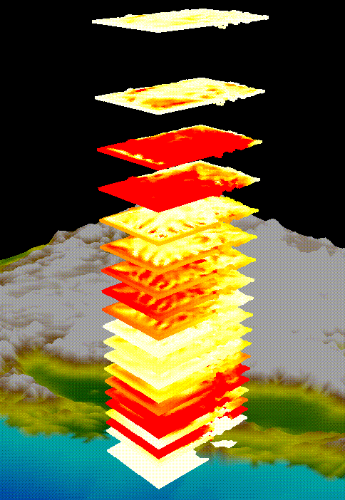 Minicubes. (47k)
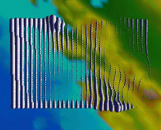
 Station data plots (22k)
 Vapor field difference from method 1. (27k)
 Vapor field difference from method 2. (29k)